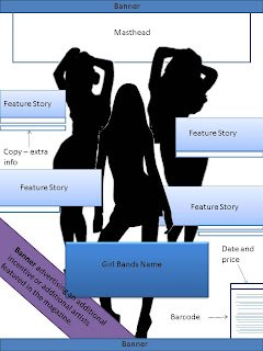
There is a choice of two colours within my templates; blue or red. I wanted to make my magazine blue as it can represent freedom - and so my magazine could represent freedom from societies rules and expectations for my audience- and the colour also isn't commonly associated with girls (as babies are still either given blue or pink blankets, toys and balloons when they are born depending on their sex) and so in breaking this convention which categorises men and women it would allow my audience to view my magazine as unprejudiced. However, at the same time I found that the colour red (as used within 'Q') represents passion, love, energy, power -which I want to interpret due to my target audience choosing the animal lion- strength and determination. All characteristics I want my audience to have and all which I want to appeal to my audience.
Front Page Templates
I used common conventions which I had found within my research of contemporary magazines: banners, masthead, feature stories, main story image, barcode, date and price; and in trying to envision what I wanted my magazine to look like I created three different templates.

Contents Page Templates
 Here again I used common conventions found in my earlier research, such as; editor's letter, page numbers, contents, wide variety of pictures, many magazines also advertised subscription plans on their contents pages and usually old or future issues of the magazine was also displayed. The most common convention I found was that of the title, in almost the magazines I found titled their content page as 'contents'. Again I created 6 templates altogether, only three being different as any others the only thing I changed was the colour scheme.
Double Page Spread Contents
For the double page spread page I interpreted the linking of two pages with either the image or the title, a technique I picked up from one the magazines I previously analysed. Other common conventions I decided to use was a quote and the large letter at the beginning of the article. I also thought that as well as a group image, individual images should be interpreted to enforce a sense of distinvtiveness between the girls. Celeberating individuality and uniqueness.


No comments:
Post a Comment